Book Series Rebranding: 7 Forbidden Arts
Project Overview
Objective: Rebrand a paranormal romance series
Client: Author Charmaine Pauls
Duration: Approx. 6 months
Work Details: Design covers and promotional assets for ten books plus the box set, including an ebook cover, print cover, social media (Facebook) page header and post graphics
Primary Challenge: Design a cohesive and marketable visual branding strategy based on the client’s selected premade cover
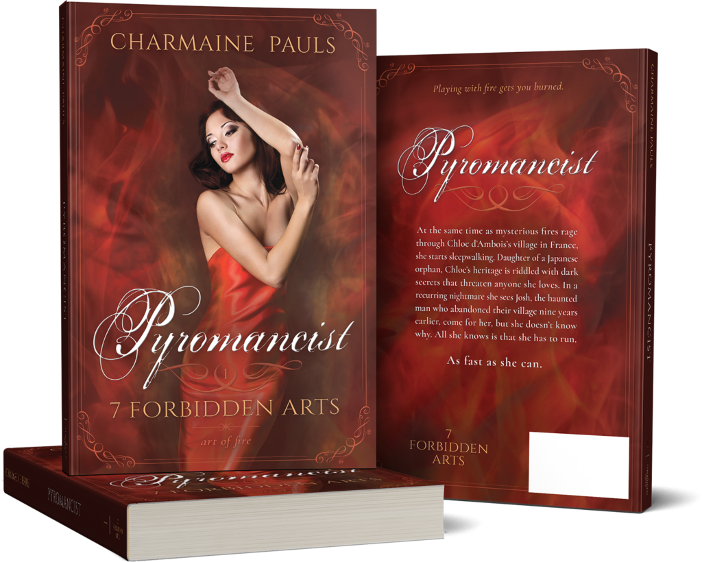
The Project
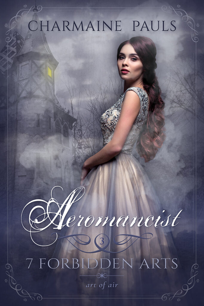
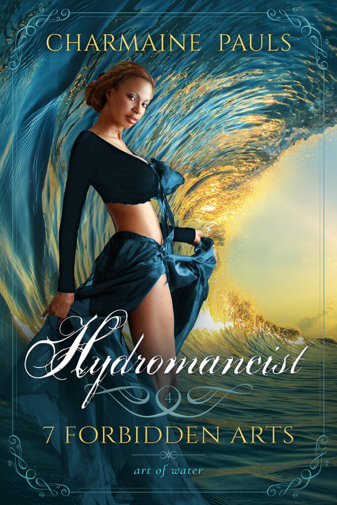
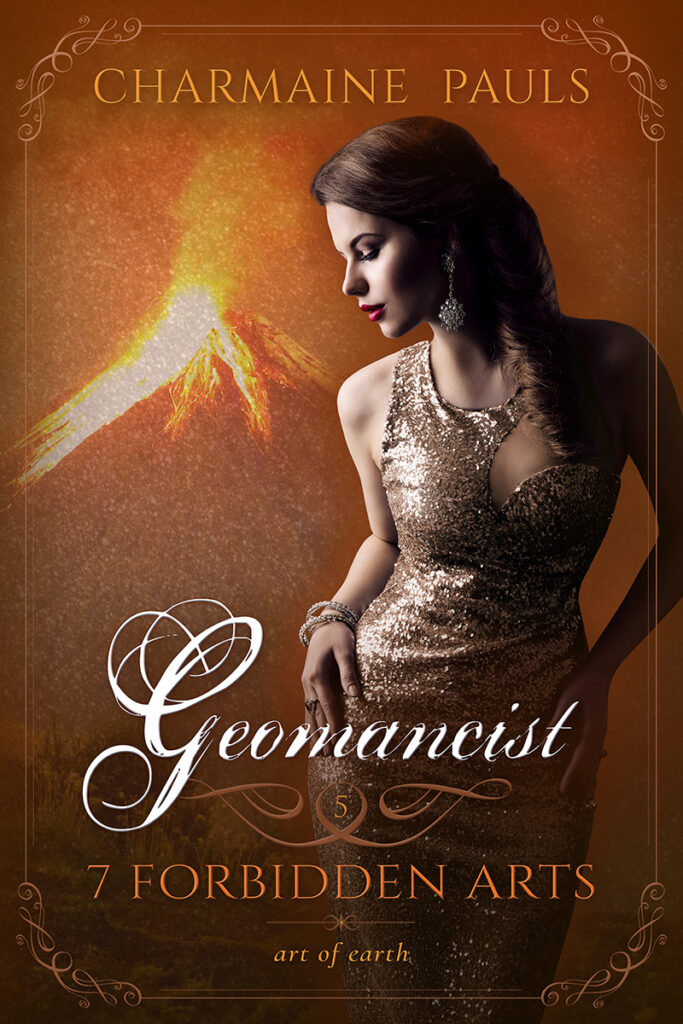
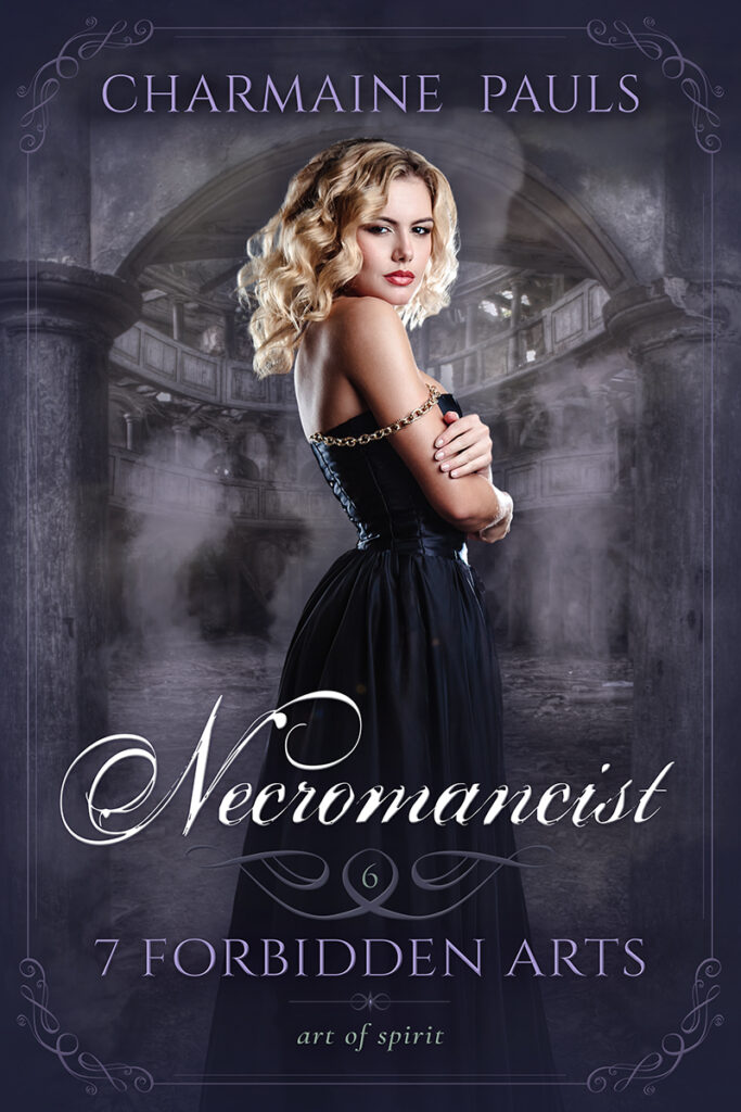
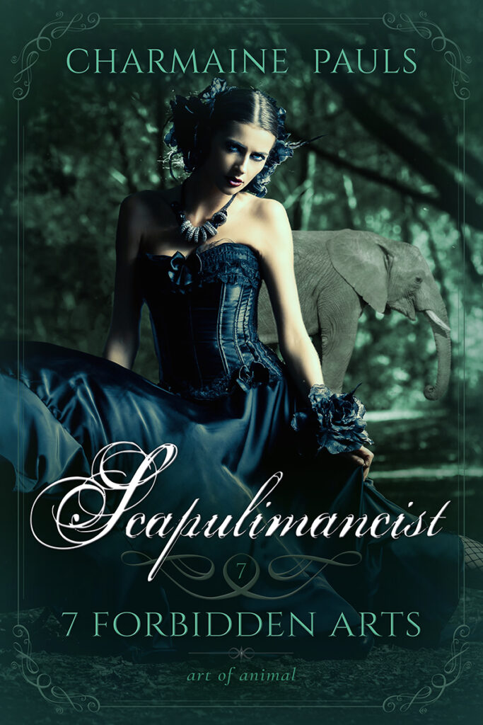
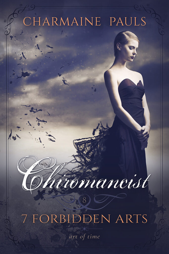
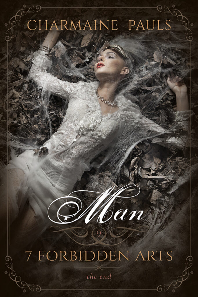
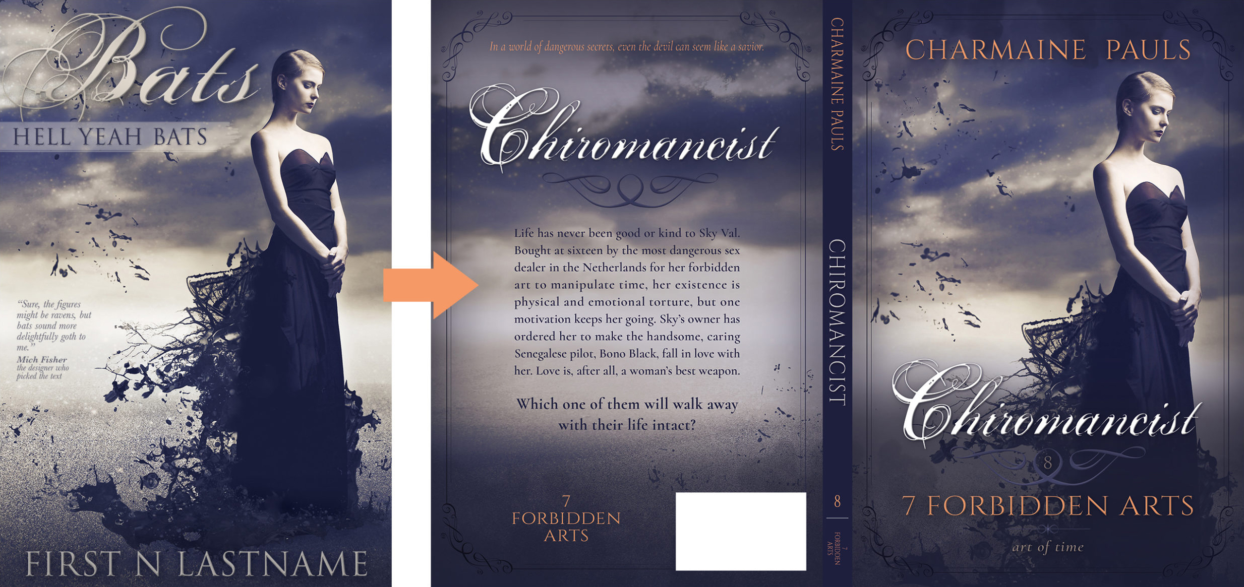
Romance author Charmaine Pauls had gained publishing rights to her 7 Forbidden Arts series and wanted to give the books a fresh new look. She loved my premade “Bats” cover — particularly the title font, dreamlike look, and fantastical aspect of the model’s deconstructed dress — and asked me to expand on that style to rebrand the series.
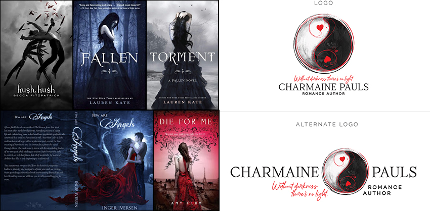
Additional Inspiration
Charmaine wanted the new book covers to better suit current visual trends in the paranormal romance genre. Like the “Bats” cover, the additional examples she provided all leaned into an ethereal, dreamy look equally steeped in dark and romantic overtones. Plus, there was an underlying elegance that was mirrored in her logo, which made a perfect foil for the lush imagery.
Series Research
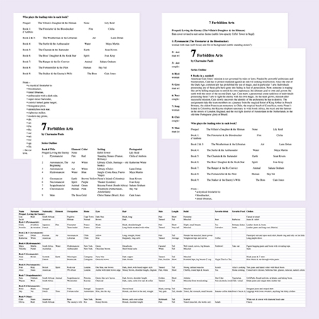
Before jumping into design, I pored over series data. Charmaine had collected a wealth of information about series characters and couples, story arcs, main book plots, and settings in handy cheat sheets. They gave me all the background I needed to compile a wish list of models, locations, and themes for a deep dive at my main stock art vendors.
Concepts
Though the protagonists of the series were both men and women, only the books’ heroines would be depicted on the covers. This would lend an emotional core and relatability to potential readers, while also providing visual consistency.
Like the “Bats” cover, the series look should be more thematic than literal. Backdrops should appear dreamlike, suggesting the setting or elemental magic featured in the story but not being too distinct and distracting from the heroine.
Process
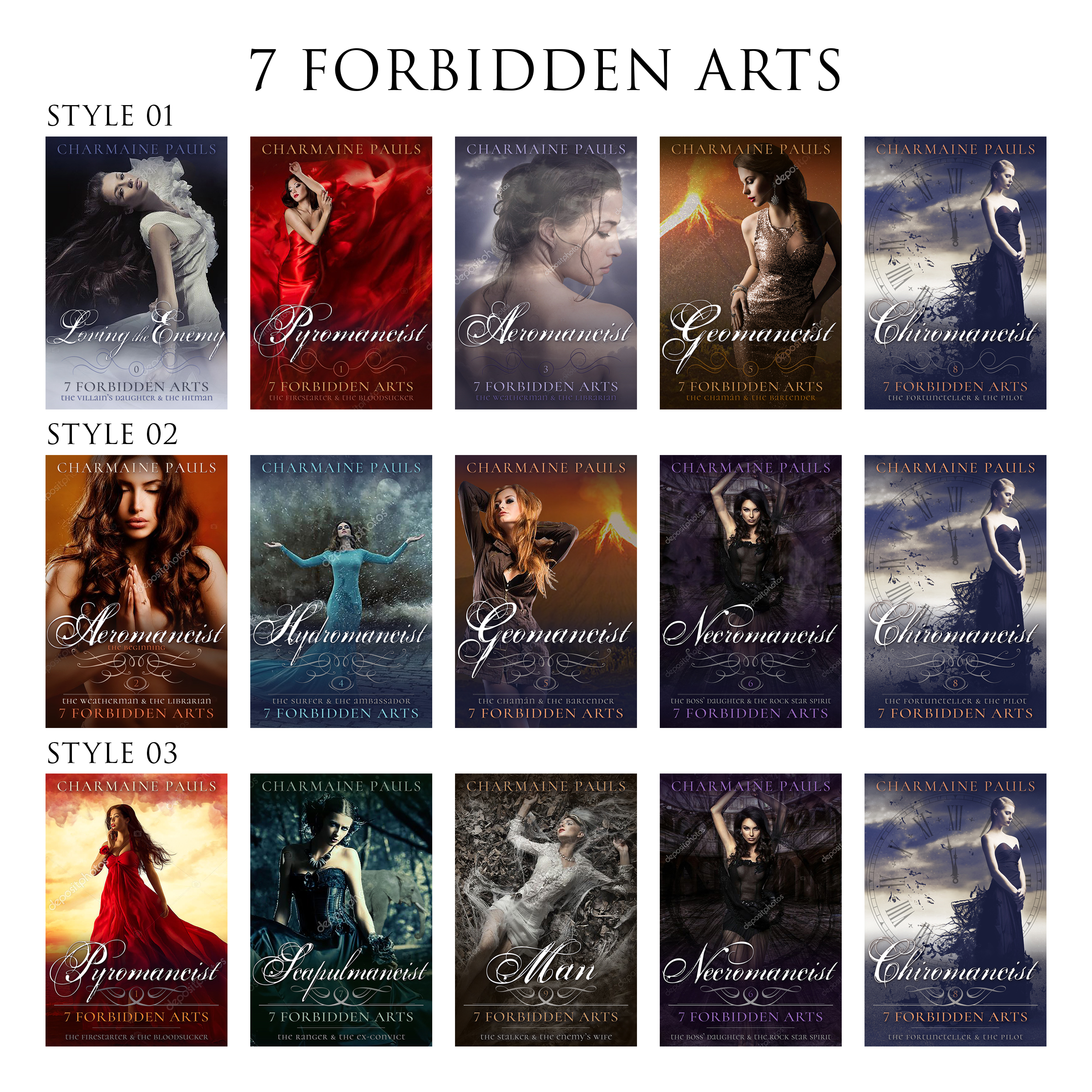
In the first phase of the stock hunt, I put together basic concept sketches of the new proposed layout with some standout photos. I moved the title down for the layout to work better with a range of photos, and included an ornament to add elegance and act as a spacer in the text block. To see how various types of shot sizes would work, I chose a mix to see which Charmaine preferred.
Finding the Heroines
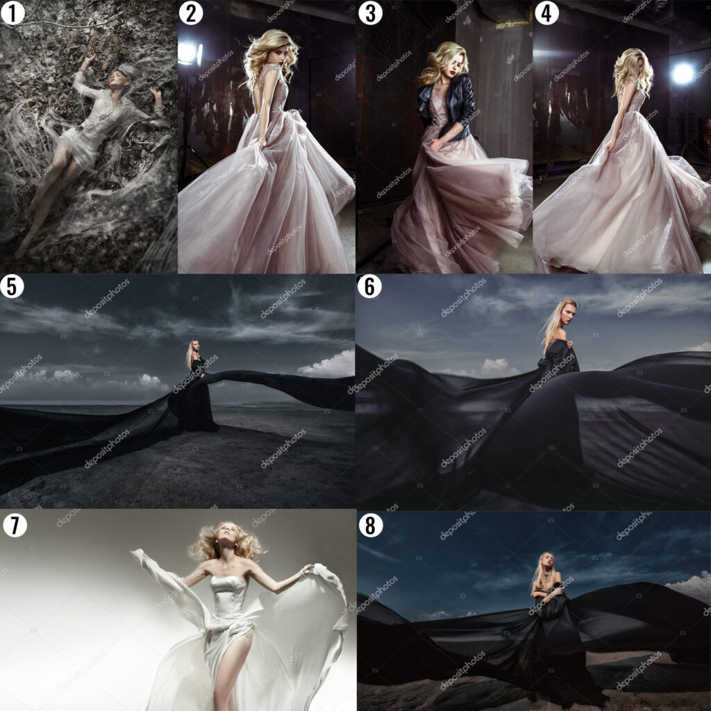
Scouring stock art vendors for the perfect models to depict the books’ heroines was one of the most critical aspects of the project. Not only did the models need to fit the heroines’ looks and vibe, the images needed to suit the tone and style of the series branding, as well as meet my high quality standards. Once I’d collected a good range of options, I sent Charmaine my top picks — never more than 10 in a bundle. If none were the ideal image for her, I used her feedback to narrow the options for the next round of samples.
Fine Tuning the Look
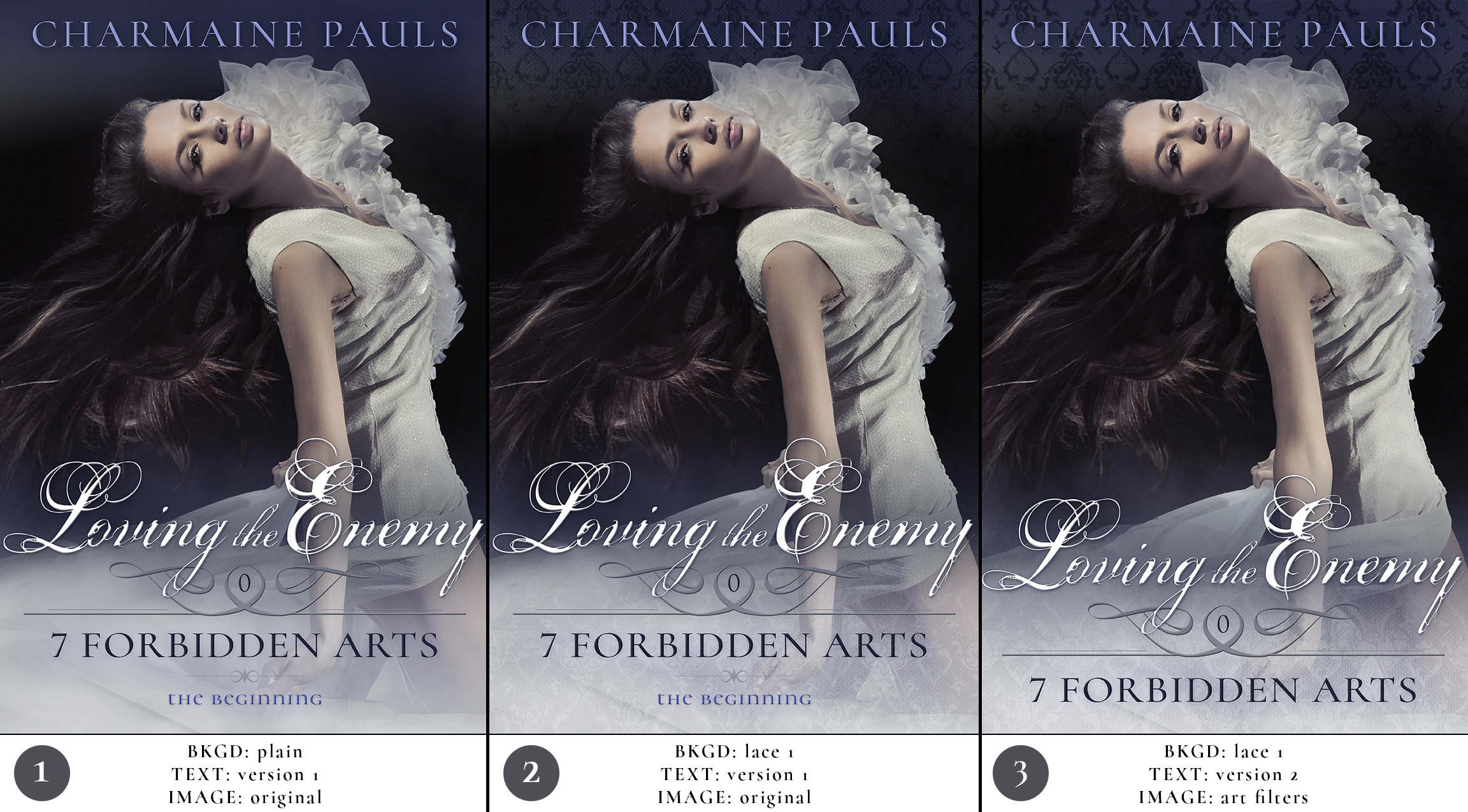
Revisions are the time to see every option that might otherwise be a regret later, because sometimes a wild hunch swings the piece into a new and exciting direction. In this case, we simply confirmed that the clean classic look was the best — also a pretty good outcome.
The Finishing Touches
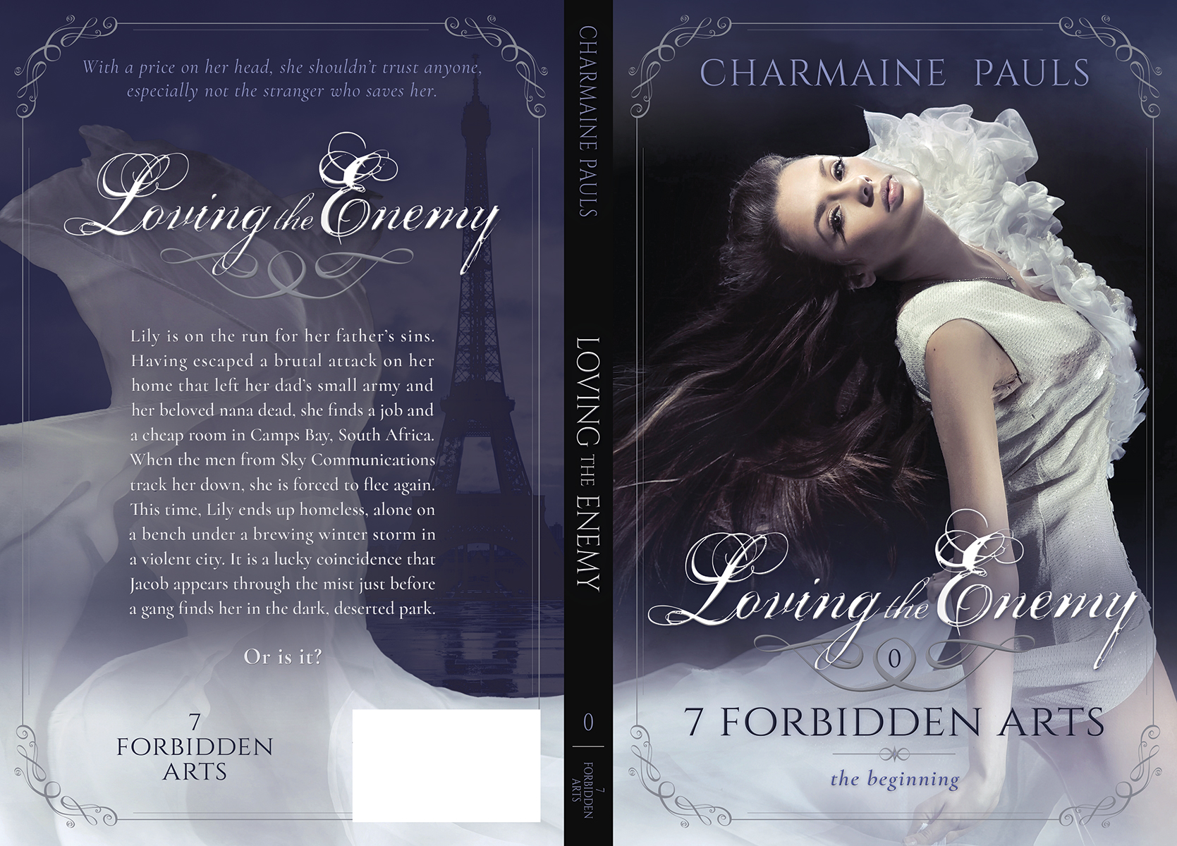
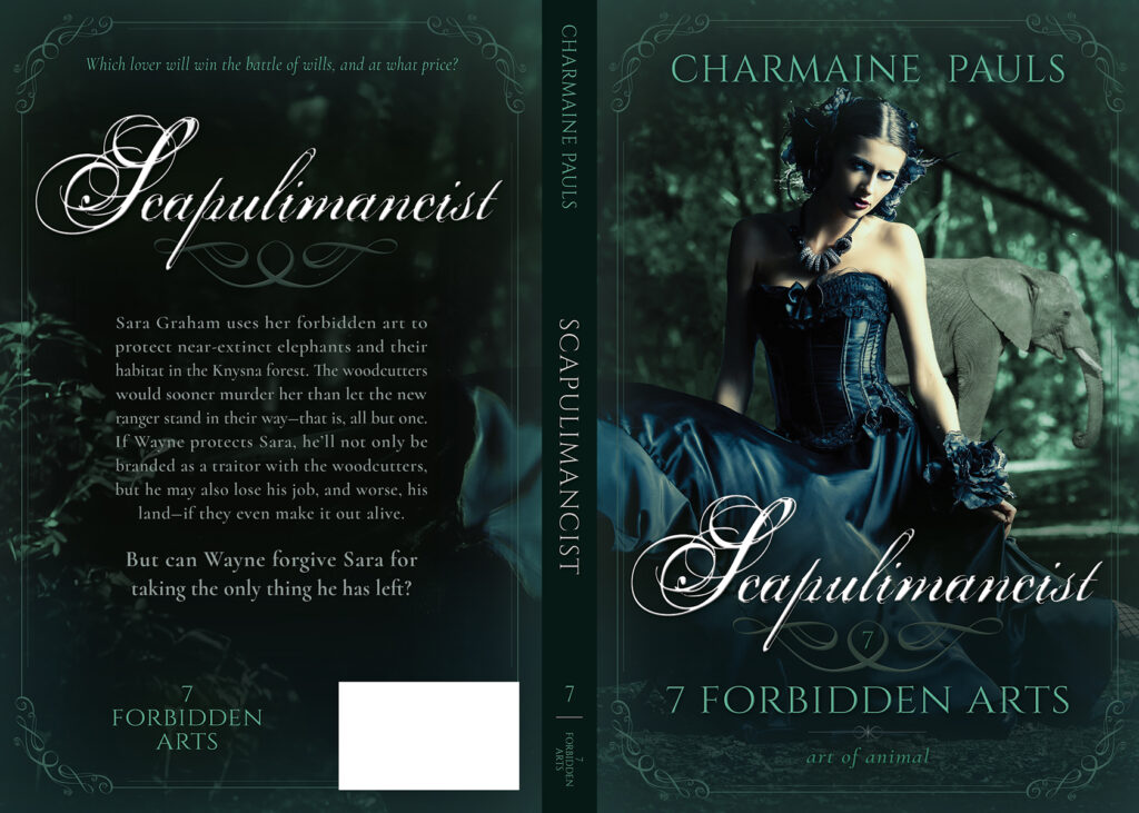
As we were nailing down the look of the series, Charmaine sent samples of covers she liked with large, ornate floral frames on the sides. While the concept was attractive, it didn’t really jive with the clean look we’d been cultivating so far. To find a suitable substitution closer to the existing theme, I removed the linear element from the ornament and used it as corners to build out a matching frame. It turned out to be the perfect finishing touch to add a hint of classic romance sophistication to our sleek modern design.
Putting it all together
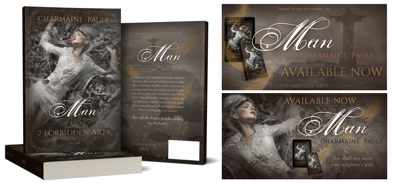
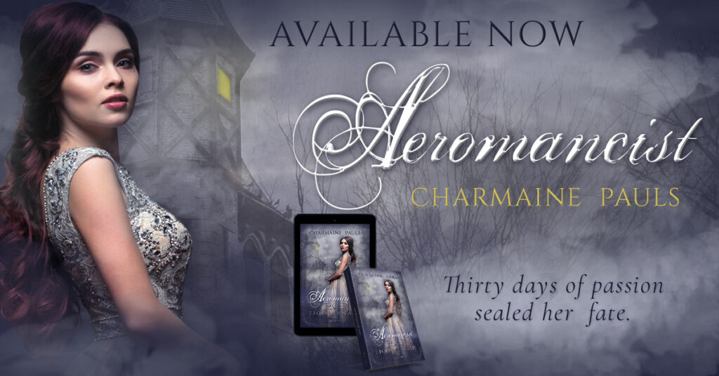
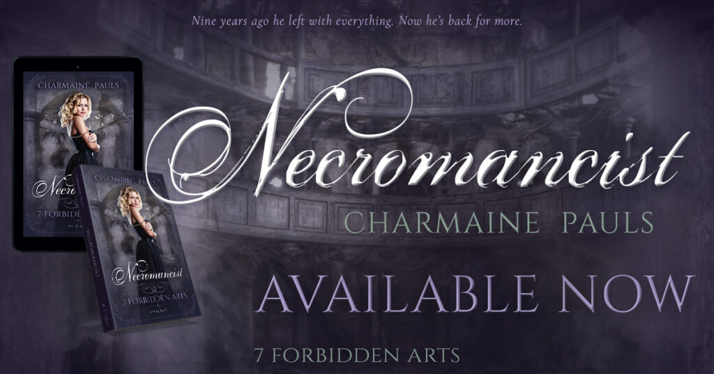
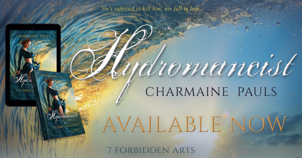
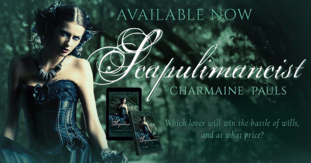
Like the covers, to be effective, the social media marketing graphics had to grab attention and engage viewers at a glance while they scroll. So I dialed the romance vibe up to eleven with lush imagery of the heroines from the front covers and teases of story and location from the backs. Then I added 3D books and tablets to complete the picture and draw in potential readers.
Completing the Set
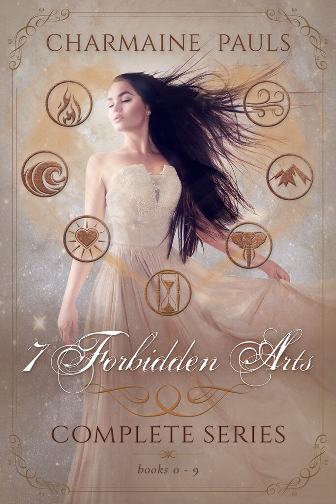
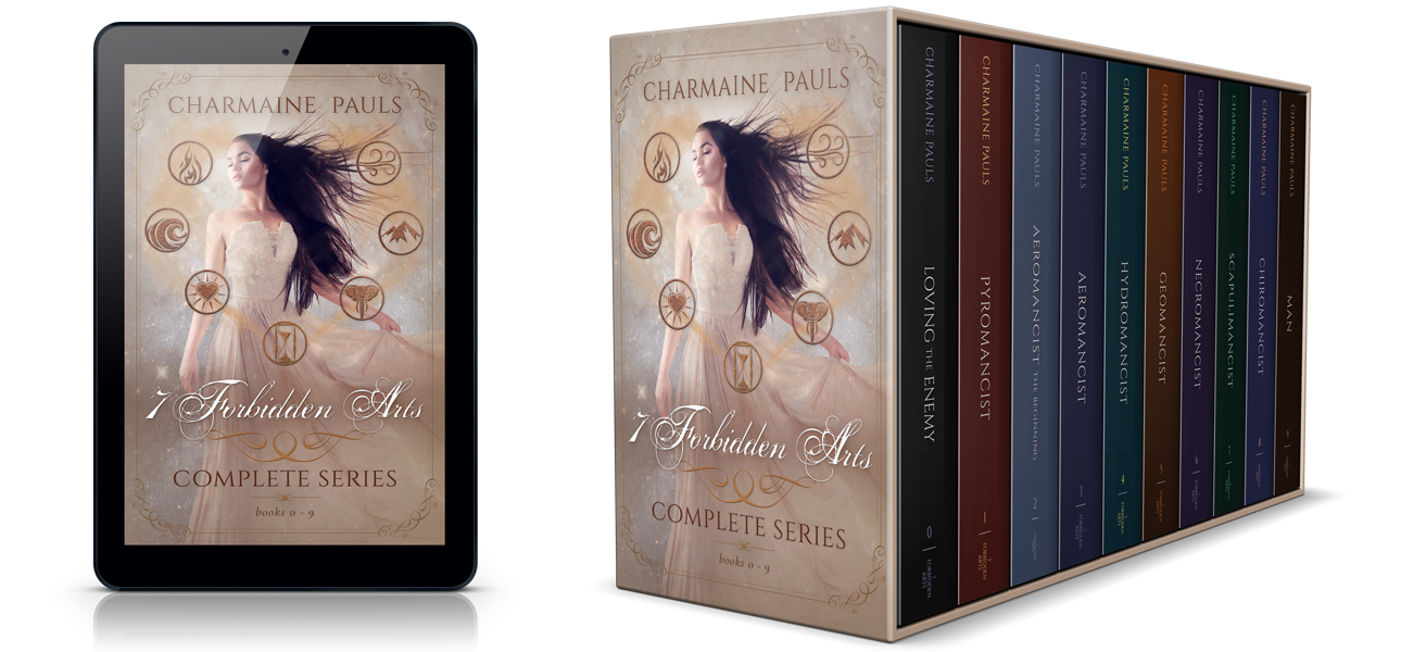
Last but not least, the box set offered another chance to add a unique touch to the branding. To tie all the stories together in one image, I created special icons to represent each of the seven forbidden arts and connected them with a gauzy mist of golden energy in the loose shape of a heart to reinforce the romantic aspect of the paranormal series.
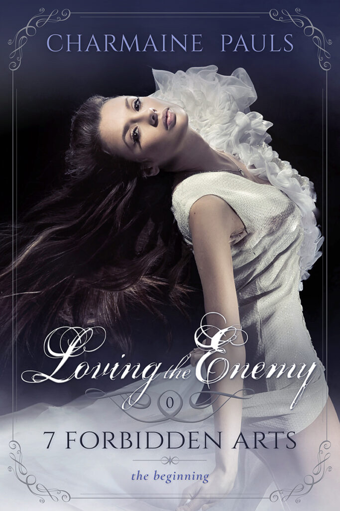
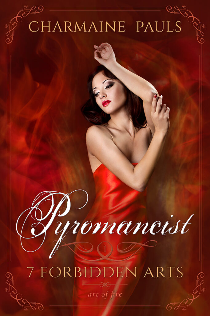
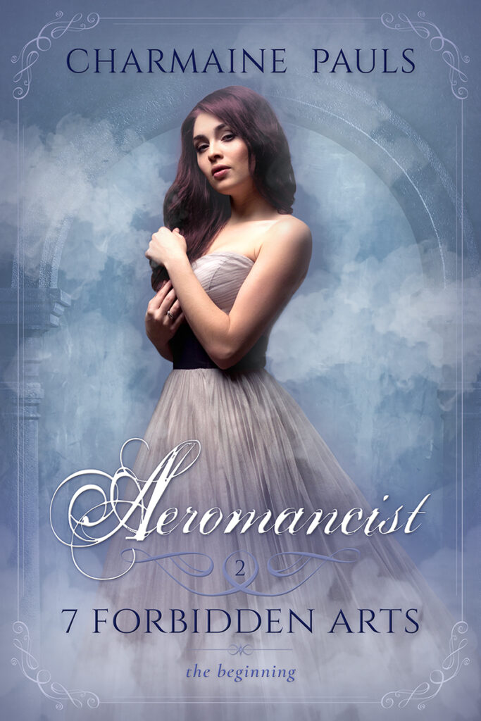
Rebranded Series Covers
Get In Touch!
Thanks for checking out my site! To reach me, click the violet text below to copy my email address to your clipboard or use the button to go to my contact form.
